Using tidymodels to Predict Health Insurance Cost
Medical Cost Personal Datasets
Insurance Forecast by using Linear Regression
Around the end of October 2020, I attended the Open Data Science Conference primarily for the workshops and training sessions that were offered. The first workshop I attended was a demonstration by Jared Lander on how to implement machine learning methods in R using a new package named tidymodels. I went into that training knowing almost nothing about machine learning, and have since then drawn exclusively from free online materials to understand how to analyze data using this “meta-package.”
As a brief introduction, tidymodels is, like tidyverse, not a single package but rather a collection of data science packages designed according to tidyverse principles. Many of the packages present in tidymodels are also present in tidyverse. What makes tidymodels different from tidyverse, however, is that many of these packages are meant for predictive modeling and provide a universal standard interface for all of the different machine learning methods available in R.
Today, we are using a data set of health insurance information from ~1300 customers of a health insurance company. This data set is sourced from a book titled Machine Learning with R by Brett Lantz.
library(tidyverse)
library(tidymodels)
library(data.table)

download.file("https://raw.githubusercontent.com/stedy/Machine-Learning-with-R-datasets/master/insurance.csv",
              "insurance.csv")

insur_dt <- fread("insurance.csv")
insur_dt %>% colnames()## [1] "age" "sex" "bmi" "children" "smoker" "region" "charges"insur_dt$age %>% summary()## Min. 1st Qu. Median Mean 3rd Qu. Max.
## 18.00 27.00 39.00 39.21 51.00 64.00insur_dt$sex %>% table()## .
## female male
## 662 676insur_dt$bmi %>% summary()## Min. 1st Qu. Median Mean 3rd Qu. Max.
## 15.96 26.30 30.40 30.66 34.69 53.13insur_dt$smoker %>% table()## .
## no yes
## 1064 274insur_dt$charges %>% summary()## Min. 1st Qu. Median Mean 3rd Qu. Max.
## 1122 4740 9382 13270 16640 63770Above, you’ll noticed I loaded packages such as parsnip and recipes. These packages, together with others, form the meta-package tidymodels used for modeling and statistical analysis. You can learn more about it here. Usually, you can simply call library(tidymodels), but Kaggle R notebooks seem unable to install and/or load it for the time being, which is fine.
As you can see, there are 7 different relatively self-explanatory variables in this data set, some of which are presumably used by the benevolent private health insurance company in question to determine how much a given individual is ultimately charged. age, sex and region appear to be demographics; with age going no lower than 18 and no greater than 64 with a mean of about 40. The two factor levels in sex seem to be about the same in quantity.
Assuming that the variable bmi corresponds to Body Mass Index, according to the CDC, a BMI of 30 or above is considered clinically obese. In our present data set, the average is just over the cusp of obese.
Next we have the number of smokers vs non-smokers. As someone who has filled out even one form before in my life, I can definitely tell you that smoker is going to be important going forward in determining the charge of each given heath insurance customer.
Lastly, we have charge. The average annual charge for health insurance is a modest $13,000.
Exploratory Data Analysis
skimr::skim(insur_dt)| Name | insur_dt |
| Number of rows | 1338 |
| Number of columns | 7 |
| _______________________ | |
| Column type frequency: | |
| character | 3 |
| numeric | 4 |
| ________________________ | |
| Group variables | None |
Variable type: character
| skim_variable | n_missing | complete_rate | min | max | empty | n_unique | whitespace |
|---|---|---|---|---|---|---|---|
| sex | 0 | 1 | 4 | 6 | 0 | 2 | 0 |
| smoker | 0 | 1 | 2 | 3 | 0 | 2 | 0 |
| region | 0 | 1 | 9 | 9 | 0 | 4 | 0 |
Variable type: numeric
| skim_variable | n_missing | complete_rate | mean | sd | p0 | p25 | p50 | p75 | p100 | hist |
|---|---|---|---|---|---|---|---|---|---|---|
| age | 0 | 1 | 39.21 | 14.05 | 18.00 | 27.00 | 39.00 | 51.00 | 64.00 | ▇▅▅▆▆ |
| bmi | 0 | 1 | 30.66 | 6.10 | 15.96 | 26.30 | 30.40 | 34.69 | 53.13 | ▂▇▇▂▁ |
| children | 0 | 1 | 1.09 | 1.21 | 0.00 | 0.00 | 1.00 | 2.00 | 5.00 | ▇▂▂▁▁ |
| charges | 0 | 1 | 13270.42 | 12110.01 | 1121.87 | 4740.29 | 9382.03 | 16639.91 | 63770.43 | ▇▂▁▁▁ |
table(insur_dt$sex)##
## female male
## 662 676I want to note that this data set is pretty clean; you will probably never encounter a data set like this in the wild. There are no NAs and, as I mentioned before, no class imbalance along sex. Let’s look at the distribution of children:
table(insur_dt$children)##
## 0 1 2 3 4 5
## 574 324 240 157 25 18Pretty standard; the plurality of people in this set do not have children. The next highest amount is 1, the second highest 2, etc.
options(repr.plot.width=15, repr.plot.height = 10)

insur_dt %>%
    select(age, bmi, children, smoker, region, charges) %>%
    GGally::ggpairs(mapping = aes(color = region))
## Registered S3 method overwritten by 'GGally':
## method from
## +.gg ggplot2## `stat_bin()` using `bins = 30`. Pick better value with `binwidth`.
## `stat_bin()` using `bins = 30`. Pick better value with `binwidth`.
## `stat_bin()` using `bins = 30`. Pick better value with `binwidth`.
## `stat_bin()` using `bins = 30`. Pick better value with `binwidth`.
## `stat_bin()` using `bins = 30`. Pick better value with `binwidth`.
## `stat_bin()` using `bins = 30`. Pick better value with `binwidth`.
## `stat_bin()` using `bins = 30`. Pick better value with `binwidth`.
## `stat_bin()` using `bins = 30`. Pick better value with `binwidth`.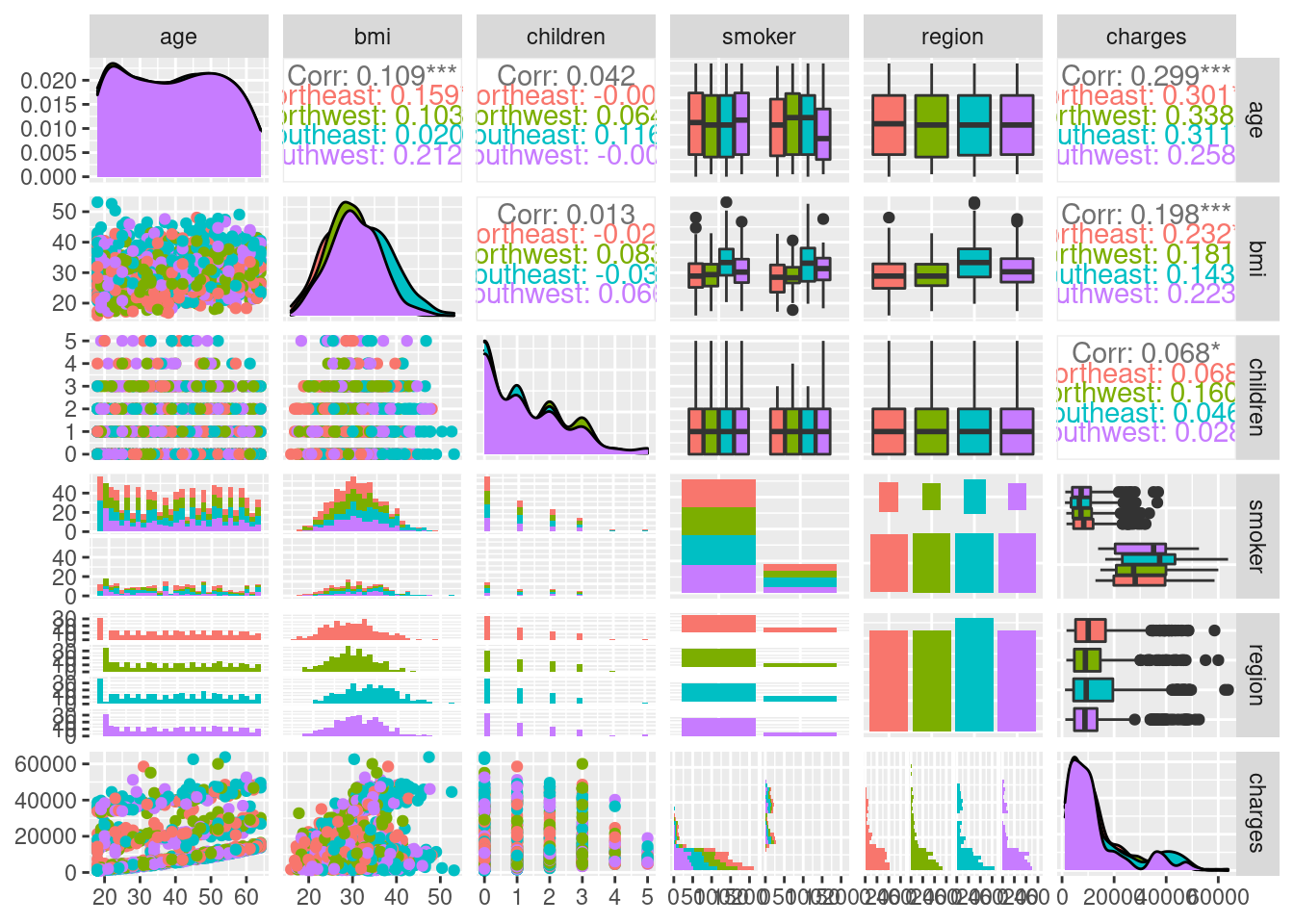
GGally is a package that facilitates the process of exploratory data analysis by automatically generating ggplots with the variables present in the input data frame to help you get a better understanding of the relationships that might exist between them. Most of these plots are just noise, but there are a few interesting ones, such as the two on the bottom left assessing charge vs age and charge vs bmi. Further to the right, there is also charge vs smoker. Let’s take a closer look at some of these relationships:
insur_dt %>% ggplot(aes(color = region)) + facet_wrap(~ region)+
  geom_point(mapping = aes(x = bmi, y = charges))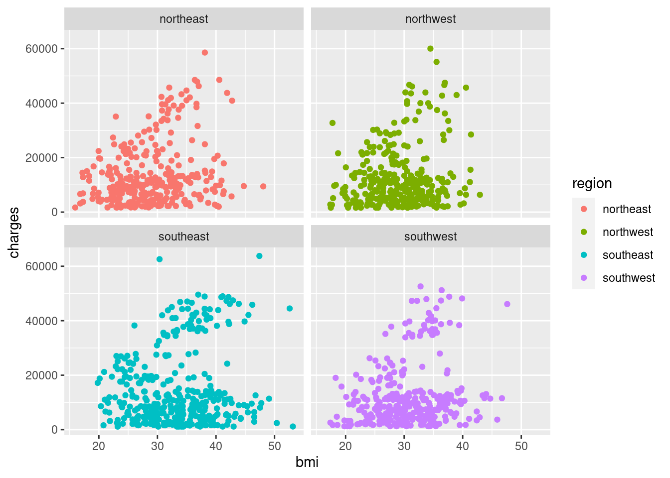
I wanted to see if there are regions that are somehow charged at a different rate than the others, but these plots all look basically the same. If you’ll notice, there are about two different blobs projecting from 0,0 to the center of the plot. We’ll get back to that later.
insur_dt %>% ggplot(aes(color = region)) + facet_wrap(~ region)+
  geom_point(mapping = aes(x = age, y = charges))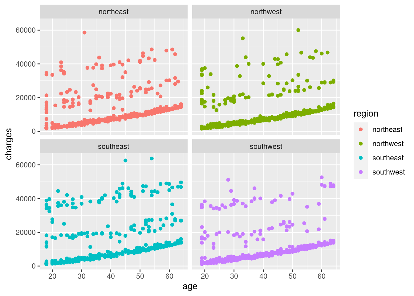
Here, I wanted to see if there was any sort of noticeable relationship between age and charges. Across the four regions, most tend to lie on a slope near the X-axis increasing modestly with age. There are, however, a pattern that appears to be two levels coming off of that baseline. Since we don’t have a variable for the type of health insurance plan these people are using, we should probably hold off on any judgements on what this could be for now.
Let’s move onto what is undoubtedly the pièce de résistance of health insurance coverage: smokers.
insur_dt %>%
    select(smoker, bmi, charges) %>%
    ggplot(aes(color = smoker)) +
    geom_point(mapping = aes(x = bmi, y = charges))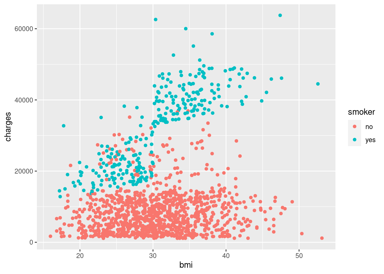
Wow. What a stark difference. Here, you can see that smoker almost creates a whole new blob of points separate from non-smokers… and that blob sharply rises after bmi = 30. Say, what was the CDC official cutoff for obesity again?
insur_dt$age_bins <- cut(insur_dt$age,
                breaks = c(18,20,30,40,50,60,70,80,90),
                include.lowest = TRUE,
                right = TRUE)

insur_dt %>%
    select(bmi, charges, sex, age_bins) %>%
    ggplot(aes(color = age_bins)) +
    geom_point(mapping = aes(x = bmi, y = charges))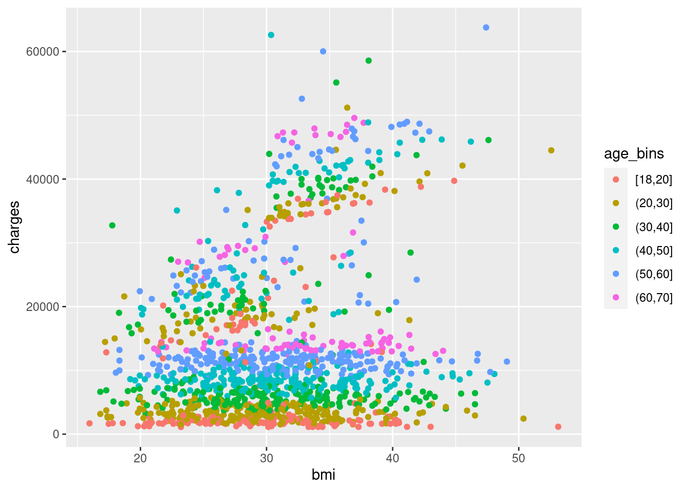
You can see that age does play a role in charge, but it’s still stratified within the 3-ish clusters of points, so even among the high-bmi smokers, younger people still pay less money than older people in a consistent way, so it makes sense. However, it does not appear that age interacts with bmi or smoker, meaning that it independently effects the charge.
insur_dt %>%
    select(children, charges, sex) %>%
    ggplot(aes(x = children, y = charges, group = children)) +
    geom_boxplot(outlier.alpha = 0.5, aes(fill = children)) +
    theme(legend.position = "none")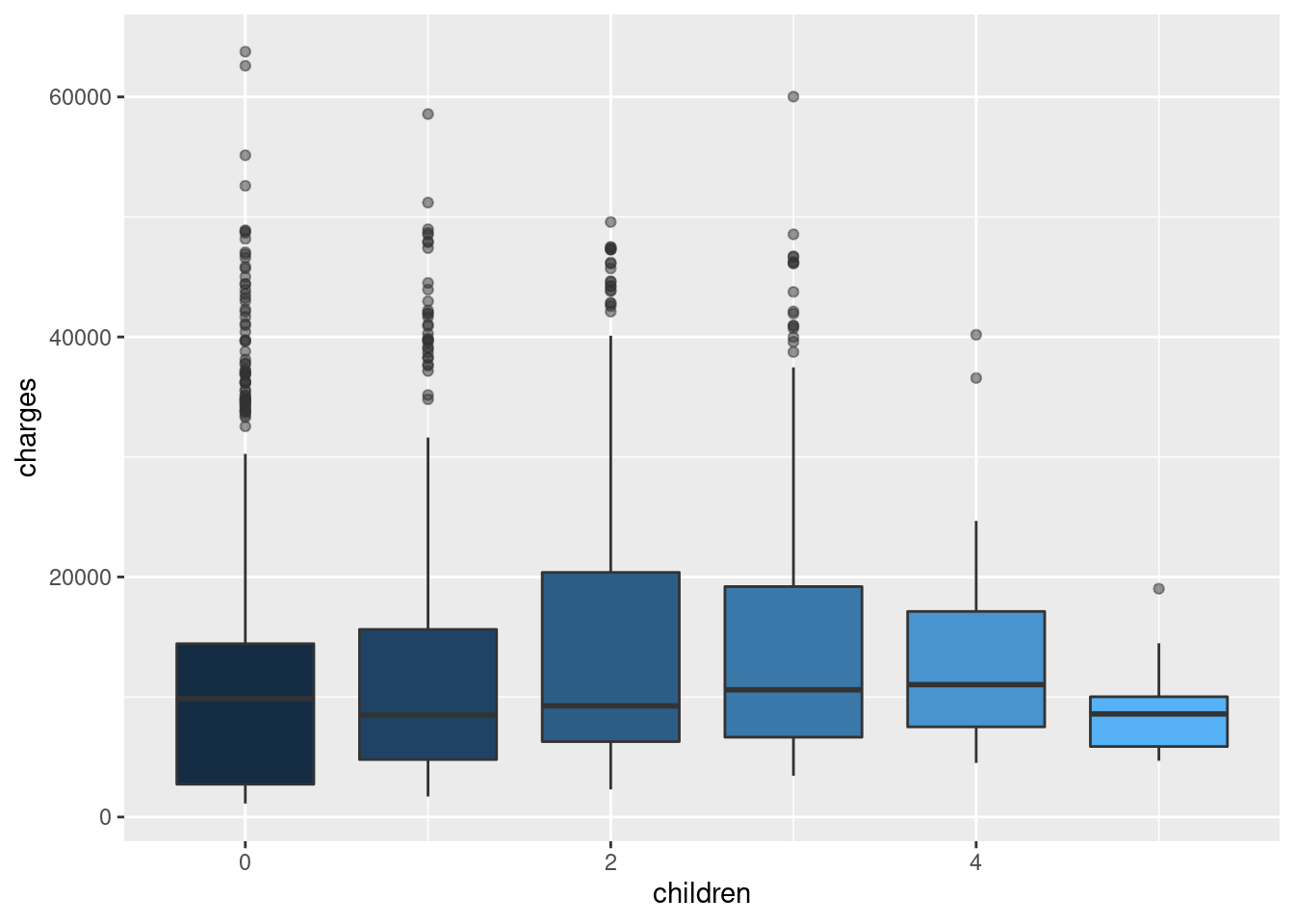
Finally, children does not affect charge significantly.
I think we’ve done enough exploratory analysis to establish that bmi and smoker together form a synergistic effect on charge, and that age also influences charge as well.
Build Model
set.seed(123)

insur_split <- initial_split(insur_dt, strata = smoker)

insur_train <- training(insur_split)
insur_test <- testing(insur_split)

# we are going to do data processing and feature engineering with recipes

# below, we are going to predict charges using everything else(".")
insur_rec <- recipe(charges ~ bmi + age + smoker, data = insur_train) %>%
    step_dummy(all_nominal()) %>%
    step_normalize(all_numeric(), -all_outcomes()) %>%
    step_interact(terms = ~ bmi:smoker_yes)

test_proc <- insur_rec %>% prep() %>% bake(new_data = insur_test)
## Warning: partial match of 'object' to 'objects'
## Warning: partial match of 'object' to 'objects'
## Warning: partial match of 'object' to 'objects'
## Warning: partial match of 'object' to 'objects'We first split our data into training and testing sets. We stratify sampling by smoker status because there is an imbalance there and we want them to be equally represented in both the training and testing data sets. This is accomplished by first conducting random sampling within these classes.
An explanation of the recipe:
We are going to model the effect of
bmi,ageandsmokeroncharges. We do not specify interactions in this step becauserecipehandles interactions as a step.We create dummy variables (
step_dummy) for all nominal predictors, sosmokerbecomessmoker_yesandsmoker_nois “implied” through omission (so if a row hassmoker_yes == 0) because some models cannot have all dummy variables present as columns. To include all dummy variables, you can useone_hot = TRUE.We then normalize all numeric predictors except our outcome variable(
step_normalize(all_numeric(), -all_outcomes())), because you generally want to avoid transformations on outcomes when training and developing a model lest another data set inconsistent with the one you’re using comes along and breaks your model. It’s best do do transformations on outcomes before creating arecipe.We are setting an interaction term;
bmiandsmoker_yes(the dummy variable forsmoker), all interact with each other when effecting the outcome. Earlier, we noticed that older patients are charged more, and that older patients with higherbmiare charged even more than that. Well, older patients with a higherbmiwho smoke are charged the most out of anyone in our data set. We observed this visually when looking at the plot, so we are going to also test this in the model we will develop.
Let’s actually specify the model. We are going to be working with a k-Nearest Neighbors model to compare it later with another model. The KNN model is simply defined as follows:`):
KNN regression is a non-parametric method that, in an intuitive manner, approximates the association between independent variables and the continuous outcome by averaging the observations in the same neighbourhood. The size of the neighbourhood needs to be set by the analyst or can be chosen using cross-validation (we will see this later) to select the size that minimises the mean-squared error.
To keep things simple, we are not going to use cross-validation to find the optimal k. Instead, we are just going to say k = 10.
knn_spec <- nearest_neighbor(neighbors = 10) %>%
    set_engine("kknn") %>%
    set_mode("regression")

knn_fit <- knn_spec %>%
    fit(charges ~ age + bmi + smoker_yes + bmi_x_smoker_yes,
        data = juice(insur_rec %>% prep()))
## Warning: partial match of 'object' to 'objects'
## Warning: partial match of 'object' to 'objects'insur_wf <- workflow() %>%
add_recipe(insur_rec) %>%
add_model(knn_spec)We specified the model knn_spec by calling the model itself from parsnip, then we set_engine and set the mode to regression. Note the neighbors parameter in nearest_neighbor. That corresponds to the k in knn.
We then fit the model using the model specification to our data. Because we already computed columns for the bmi and smoker_yes interaction, we do not need to represent the interaction formulaically again.
Let’s evaluate this model to see how it does.
insur_cv <- vfold_cv(insur_train, prop = 0.9)

insur_rsmpl <- fit_resamples(insur_wf,
                           insur_cv,
                           control = control_resamples(save_pred = TRUE))
##
## Attaching package: 'rlang'## The following object is masked from 'package:data.table':
##
## :=## The following objects are masked from 'package:purrr':
##
## %@%, as_function, flatten, flatten_chr, flatten_dbl, flatten_int,
## flatten_lgl, flatten_raw, invoke, list_along, modify, prepend,
## splice##
## Attaching package: 'vctrs'## The following object is masked from 'package:dplyr':
##
## data_frame## The following object is masked from 'package:tibble':
##
## data_frame## ! Fold01: preprocessor 1/1: partial match of 'object' to 'objects'## ! Fold01: preprocessor 1/1, model 1/1 (predictions): partial match of 'object' to ...## ! Fold02: preprocessor 1/1: partial match of 'object' to 'objects'## ! Fold02: preprocessor 1/1, model 1/1 (predictions): partial match of 'object' to ...## ! Fold03: preprocessor 1/1: partial match of 'object' to 'objects'## ! Fold03: preprocessor 1/1, model 1/1 (predictions): partial match of 'object' to ...## ! Fold04: preprocessor 1/1: partial match of 'object' to 'objects'## ! Fold04: preprocessor 1/1, model 1/1 (predictions): partial match of 'object' to ...## ! Fold05: preprocessor 1/1: partial match of 'object' to 'objects'## ! Fold05: preprocessor 1/1, model 1/1 (predictions): partial match of 'object' to ...## ! Fold06: preprocessor 1/1: partial match of 'object' to 'objects'## ! Fold06: preprocessor 1/1, model 1/1 (predictions): partial match of 'object' to ...## ! Fold07: preprocessor 1/1: partial match of 'object' to 'objects'## ! Fold07: preprocessor 1/1, model 1/1 (predictions): partial match of 'object' to ...## ! Fold08: preprocessor 1/1: partial match of 'object' to 'objects'## ! Fold08: preprocessor 1/1, model 1/1 (predictions): partial match of 'object' to ...## ! Fold09: preprocessor 1/1: partial match of 'object' to 'objects'## ! Fold09: preprocessor 1/1, model 1/1 (predictions): partial match of 'object' to ...## ! Fold10: preprocessor 1/1: partial match of 'object' to 'objects'## ! Fold10: preprocessor 1/1, model 1/1 (predictions): partial match of 'object' to ...insur_rsmpl %>% collect_metrics()## # A tibble: 2 x 6
## .metric .estimator mean n std_err .config
## <chr> <chr> <dbl> <int> <dbl> <chr>
## 1 rmse standard 4916. 10 274. Preprocessor1_Model1
## 2 rsq standard 0.827 10 0.0194 Preprocessor1_Model1summary(insur_dt$charges)## Min. 1st Qu. Median Mean 3rd Qu. Max.
## 1122 4740 9382 13270 16640 63770We set vfold_cv (which is the cross validation that most people are familiar with, wherein the training data is split into V folds and then is trained on V-1 folds in order to make a prediction on the last fold, and is repeated so that all folds are trained and used as a prediction fold) to a prop of 0.9, which is the same as specifying 9 training folds and 1 testing fold (within our training data).
We then finally run the cross validation by using fit_resamples. As you can see, we used our workflow object as our input.
Finally, we call collect_metrics to examine the model effectiveness. We end up with an rmse of 4,915 and an rsq of 0.82. The RMSE would suggest that, on average, our predictions varied from observed values by an absolute measure of 4,915, in this case, dollars in charges. The R^2 would suggest that our regression has a fit of ~82%, although a high R^2 doesn’t always mean the model has a good fit and a low R^2 doesn’t always mean that a model has a poor fit.
insur_rsmpl %>%
    unnest(.predictions) %>%
    ggplot(aes(charges, .pred, color = id)) +
    geom_abline(lty = 2, color = "gray80", size = 1.5) +
    geom_point(alpha = 0.5) +
    theme(legend.position = "none")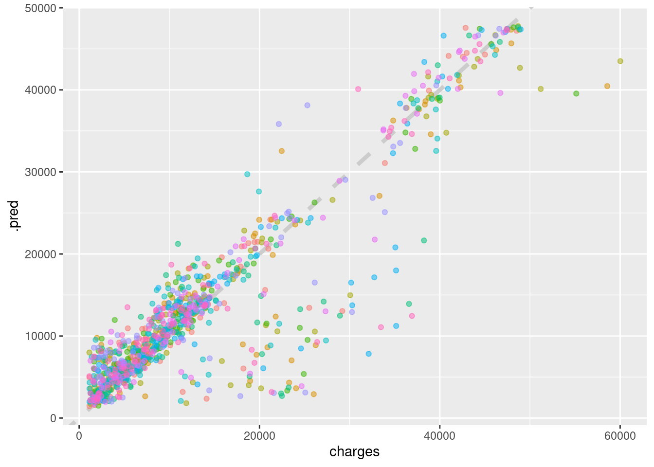
Above is a demonstration of our regression fit to a line. There is a large cluster of values that are model simply does not capture, and we could learn more about these points, but instead we are going to move on to applying our model to our test data, which we defined much earlier in this project.
insur_test_res <- predict(knn_fit, new_data = test_proc %>% select(-charges))## Warning: partial match of 'fit' to 'fitted.values'insur_test_res <- bind_cols(insur_test_res, insur_test %>% select(charges))
insur_test_res## # A tibble: 334 x 2
## .pred charges
## <dbl> <dbl>
## 1 4339. 3757.
## 2 27038. 27809.
## 3 2231. 1837.
## 4 6500. 6204.
## 5 2794. 4688.
## 6 6057. 6314.
## 7 14335. 12630.
## 8 1663. 2211.
## 9 5655. 3580.
## 10 39401. 37743.
## # … with 324 more rowsWe’ve now applied our model to test_proc, which is the test set after we’ve used the recipes preprocessing steps on them to transform them in the same way we transformed our training data. We bind the resulting predictions with the actual charges found in the training data to create a two-column table with our predictions and the corresponding real values we attempted to predict.
ggplot(insur_test_res, aes(x = charges, y = .pred)) +
  # Create a diagonal line:
  geom_abline(lty = 2) +
  geom_point(alpha = 0.5) +
  labs(y = "Predicted Charges", x = "Charges") +
  # Scale and size the x- and y-axis uniformly:
  coord_obs_pred()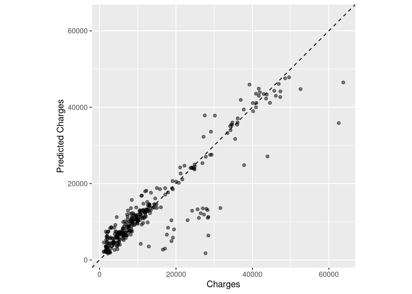
rmse(insur_test_res, truth = charges, estimate = .pred)## # A tibble: 1 x 3
## .metric .estimator .estimate
## <chr> <chr> <dbl>
## 1 rmse standard 4985.insur_rsmpl %>%
collect_metrics()## # A tibble: 2 x 6
## .metric .estimator mean n std_err .config
## <chr> <chr> <dbl> <int> <dbl> <chr>
## 1 rmse standard 4916. 10 274. Preprocessor1_Model1
## 2 rsq standard 0.827 10 0.0194 Preprocessor1_Model1Nice! The RMSE generated by our test data is insignificantly different from the one generated by our cross-validation! That means our model can reliably reproduce predictions with approximately the same level of error.
Another great thing about tidymodels is that it streamlines the process of comparing predictive performance between two different models. Allow me to demonstrate.
Linear Regression
We already have the recipe. All we need now is to specify a linear model and cross-validate the fit to test it on the testing data.
lm_spec <- linear_reg() %>%
    set_engine("lm")

lm_fit <- lm_spec %>%
    fit(charges ~ age + bmi + smoker_yes + bmi_x_smoker_yes,
        data = juice(insur_rec %>% prep()))
## Warning: partial match of 'object' to 'objects'
## Warning: partial match of 'object' to 'objects'insur_lm_wf <- workflow() %>%
add_recipe(insur_rec) %>%
add_model(lm_spec)We just repeat some of the same steps that we did for KNN but for the linear model. We can even cross-validate by using (almost) the same command:
insur_lm_rsmpl <- fit_resamples(insur_lm_wf,
                           insur_cv,
                           control = control_resamples(save_pred = TRUE))
## ! Fold01: preprocessor 1/1: partial match of 'object' to 'objects'## ! Fold01: preprocessor 1/1, model 1/1 (predictions): partial match of 'object' to ...## ! Fold02: preprocessor 1/1: partial match of 'object' to 'objects'## ! Fold02: preprocessor 1/1, model 1/1 (predictions): partial match of 'object' to ...## ! Fold03: preprocessor 1/1: partial match of 'object' to 'objects'## ! Fold03: preprocessor 1/1, model 1/1 (predictions): partial match of 'object' to ...## ! Fold04: preprocessor 1/1: partial match of 'object' to 'objects'## ! Fold04: preprocessor 1/1, model 1/1 (predictions): partial match of 'object' to ...## ! Fold05: preprocessor 1/1: partial match of 'object' to 'objects'## ! Fold05: preprocessor 1/1, model 1/1 (predictions): partial match of 'object' to ...## ! Fold06: preprocessor 1/1: partial match of 'object' to 'objects'## ! Fold06: preprocessor 1/1, model 1/1 (predictions): partial match of 'object' to ...## ! Fold07: preprocessor 1/1: partial match of 'object' to 'objects'## ! Fold07: preprocessor 1/1, model 1/1 (predictions): partial match of 'object' to ...## ! Fold08: preprocessor 1/1: partial match of 'object' to 'objects'## ! Fold08: preprocessor 1/1, model 1/1 (predictions): partial match of 'object' to ...## ! Fold09: preprocessor 1/1: partial match of 'object' to 'objects'## ! Fold09: preprocessor 1/1, model 1/1 (predictions): partial match of 'object' to ...## ! Fold10: preprocessor 1/1: partial match of 'object' to 'objects'## ! Fold10: preprocessor 1/1, model 1/1 (predictions): partial match of 'object' to ...insur_lm_rsmpl %>%
collect_metrics()## # A tibble: 2 x 6
## .metric .estimator mean n std_err .config
## <chr> <chr> <dbl> <int> <dbl> <chr>
## 1 rmse standard 4866. 10 251. Preprocessor1_Model1
## 2 rsq standard 0.832 10 0.0162 Preprocessor1_Model1insur_rsmpl %>%
collect_metrics()## # A tibble: 2 x 6
## .metric .estimator mean n std_err .config
## <chr> <chr> <dbl> <int> <dbl> <chr>
## 1 rmse standard 4916. 10 274. Preprocessor1_Model1
## 2 rsq standard 0.827 10 0.0194 Preprocessor1_Model1Fascinating! It appears that the good, ol’ fashioned linear model beat k-Nearest Neighbors both in terms of RMSE but also R^2 across 10 cross-validation folds.
insur_test_lm_res <- predict(lm_fit, new_data = test_proc %>% select(-charges))

insur_test_lm_res <- bind_cols(insur_test_lm_res, insur_test %>% select(charges))

insur_test_lm_res
## # A tibble: 334 x 2
## .pred charges
## <dbl> <dbl>
## 1 6335. 3757.
## 2 31938. 27809.
## 3 3171. 1837.
## 4 7878. 6204.
## 5 3081. 4688.
## 6 7815. 6314.
## 7 14070. 12630.
## 8 2656. 2211.
## 9 3498. 3580.
## 10 36293. 37743.
## # … with 324 more rowsNow that we have our predictions, let’s look at how well the linear model fared:
ggplot(insur_test_lm_res, aes(x = charges, y = .pred)) +
  # Create a diagonal line:
  geom_abline(lty = 2) +
  geom_point(alpha = 0.5) +
  labs(y = "Predicted Charges", x = "Charges") +
  # Scale and size the x- and y-axis uniformly:
  coord_obs_pred()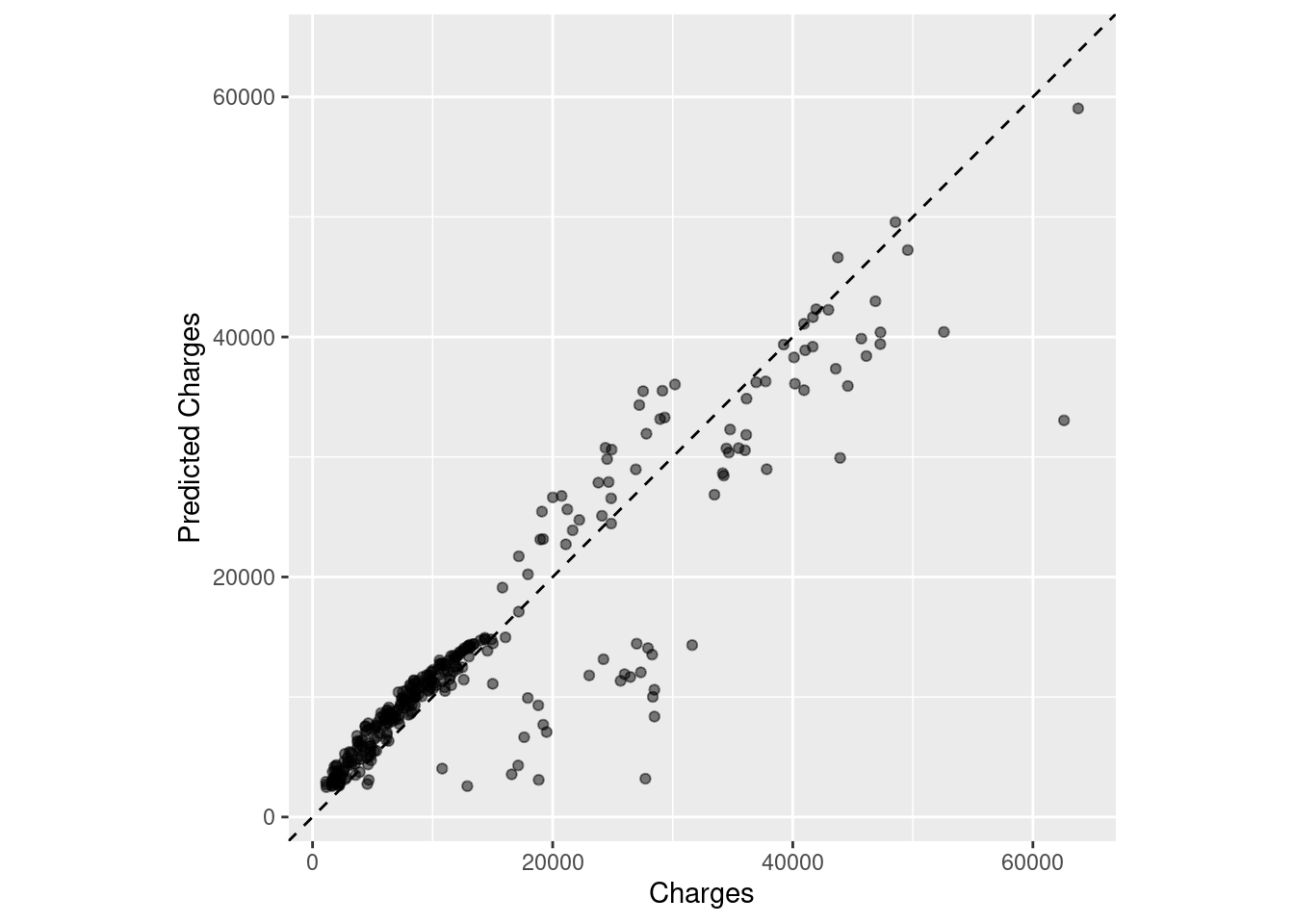
It seems as though the area on the bottom left corner had the greatest concentration of charges, and explains most of the lm fit. Look at both of these plots makes me wonder if there was a better model we could have used, but our model was sufficient given our purposes and level of accuracy.
combind_dt <- mutate(insur_test_lm_res,
      lm_pred = .pred,
      charges = charges
      ) %>% select(-.pred) %>%
    add_column(knn_pred = insur_test_res$.pred)

ggplot(combind_dt, aes(x = charges)) +
    geom_line(aes(y = knn_pred, color = "kNN Fit"), size = 1) +
    geom_line(aes(y = lm_pred, color = "lm Fit"), size = 1) +
    geom_point(aes(y = knn_pred, alpha = 0.5), color = "#F99E9E") +
    geom_point(aes(y = lm_pred, alpha = 0.5), color = "#809BF4") +
    geom_abline(size = 0.5, linetype = "dashed") +
    xlab('Charges') +
    ylab('Predicted Charges') +
    guides(alpha = FALSE)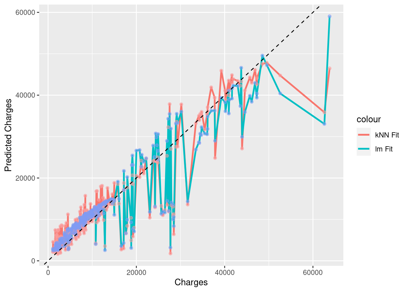
Above is a comparison of the two methods with their respective predictions, and with the dotted line representing the “correct” values. In this case, the two models were not different enough from each other for their differences to be readily observed when plotted against each other, but there will be instances in the future wherein your two models do differ substantially, and this sort of plot will bolster your case for using one model over another.
Conclusion
Here, we were able to build a KNN model with our training data and use it to predict values in our testing data. To do this, we:
performed EDA
preprocessed our data using
recipesspecified our model to be KNN
fit it to our training data
ran cross validation to produce accurate error statistics
predicted values in our test set
compared observed test set values with our predictions
specified another model, lm
performed a cross-validation
discovered lm to be the better model
I’m very excited to continue using tidymodels in R as a way to apply machine learning methods. If you’re interested, I recommend checking out Tidy Modeling with R by Max Kuhn and Julia Silge.